Technical communicators strive to provide high-quality content to users when and where they need it. With responsive design it is now possible to create content that automatically adjusts to the device.
Responsive web design is a transformative technology for technical communicators. With responsive design content adapts to the device – be it a desktop, mobile phone, tablet, or other. It gives technical writers the means to create content once and deliver it anywhere, to thousands of devices: new ones, older ones – even ones that don’t exist yet. Responsive design makes content flexible, so technical writers can focus on what they do best: developing high quality content.
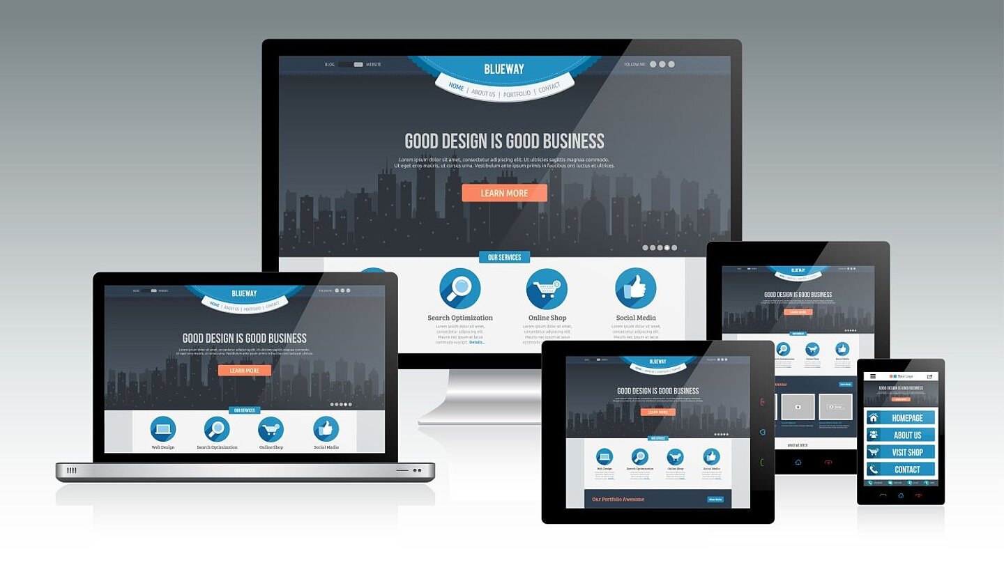
Before I go any further, a quick explanation of what I mean by “responsive”. Responsive web design is a technique for designing web pages that automatically adjust to the device accessing them. No content is lost in responsive design; the content and the page layout simply adjust by stacking or collapsing. There is no horizontal scroll bar. Interactions – such as touch – are also components of responsive design.
In ...
Read more after login
tekom members can log in directly with their "My tekom" access data.
You are not yet a tekom member, but would like to read one or more articles in full? Then you have the opportunity to register on the internet portal of the technical journal 'tcworld' without obligation. Once you have registered, you can select any three specialist articles and view them in full for a period of two months. The selection will then be deleted and you can select three new articles for the next two months.
As a tekom member you benefit from the following advantages::
- Online access to all articles of the trade magazine 'tcworld magazine'
- Exclusive specialist articles from all areas of technical communication
- Regular new articles from over 300 authors
- The technical journal 'tcworld magazine' as a printed edition
- Reduced admission prices to tekom conferences
- Membership fees for tekom publications
- Access to 'my tekom', the web forum with job offers / job requests, appointments, expert advice, service provider file and much more
Login
Registration
Promised: The trade magazine 'tcworld magazine' is the best we have. And we don't make the choice easy for ourselves. Every month, the editorial staff of the technical journal 'tcworld magazine' publishes the latest articles by renowned authors. This demanding selection is available exclusively to members of tekom (as usual, including the printed edition).
The trade magazine 'tcworld magazine' stands for intelligently prepared specialist articles, texts written to the point, informative content, surprising insights, international perspectives and communicates technical communication in an understandable, fast, clear and uncomplicated way - exclusively for you.