
Lots of challenges arise when localizing documents. We encounter them when preparing texts for translation, selecting the team of linguists, organizing the process, managing the project, and performing the translation itself with its numerous stages. Each of these steps is a complicated and multi-stage process requiring a professional approach. And after the translation is finished, the work with documents continues, as we need to prepare the material for release. In short, we need to give shape to the words. That’s why the final steps of creating documents in target languages involve desktop publishing specialists, designers, and other experts in document layout, drawing, graphic elements, etc. One of the difficulties that can appear in the final stage of desktop-publishing a translated text is that the original document layout or the design of the original graphic element does not quite match, as the translated text either does not fit or leaves empty space. When text is translated, the space it occupies on the digital or physical page often changes significantly.
In this article, we will talk about our experience with text post-processing and share our considerations of what influences the change in text size after translation. Our company has 20 years of experience in the language industry; we started offering document desktop publishing back in 2006. Today, our desktop publishing department consists of 10 staff members as well as 49 freelancers (desktop publishing specialists and designers) who work with us every day. We process dozens of documents daily, working with desktop publishing in numerous languages. As a result, we have discovered and documented the peculiarities of working with many languages, to simplify our further work on similar projects. In this article, I have collected insights on this topic from the leading specialists at InText.
What causes the changes in the size of text after translation? In our opinion, two main groups of factors should be highlighted: linguistic factors, i.e., the actual difference between the number of characters before and after translation, and typographical factors. Here is how they impact the outcome.
Linguistic factors: difference in number of characters
There’s no doubt that the number of characters in the target text after translation may differ from the number of characters in the source text. This has become the subject of research for linguists, and there are several factors influencing text expansion or contraction.
The first concerns peculiarities of the target language: to which language group it belongs, which symbolic system is used, and other linguistic nuances. For example, when we translate from English into Chinese, the number of characters will decrease, as the source and target languages use completely different writing systems: alphabetic vs. logographic. But when we translate English text into German, the number of characters will increase. There are a lot of similar examples, as each language has its own history and peculiarities.
Another important factor is the topic of the translated text. A skilled translator can choose words that will minimize the difference in text volume, wherever possible. Literary texts are more flexible in this regard compared to medical, legal, and complex technical texts. Especially in the latter case, the translated text must correspond as closely as possible to the source text. The same applies to text styles: Colloquial text, for example, is more flexible than formal text. There are also cases when the translation is prepared for an "uninitiated" target audience, where the original terms are not translated in the usual manner but are rendered in the form of extended explanations. This procedure, also known as adaptive transcoding, will significantly increase the size of the translated text.
Another important aspect is the overall text length. The shorter the source text, the fewer opportunities there are to adapt it. Below, you will find the average expected expansion rates for text translated from U.S. English into European languages, as published by IBM in their Guideline for designing globalized applications.
Number of characters in text | Additional space required |
Up to 10 | 100 – 200% |
11–20 | 80 – 100% |
21–30 | 60 – 80% |
31–50 | 40 – 60% |
51–70 | 31 – 40% |
Over 70 | 30% |
Table 1: Change in text size from U.S. English into European languages
This data represents averages, and the actual expansion rate will vary for each specific case. However, the patterns are particularly noticeable when localizing software user interfaces. Here, it’s often necessary to localize short phrases, which is a real challenge for any translator. That’s why it’s important to take possible future localization into account at the development stage.
Nevertheless, it’s not enough to consider only the difference in the number of characters when working with desktop publishing. There are other significant factors to consider, including typographical ones. But before we get into the details, we would like to present some infographics based on 10+ years of experience processing thousands of documents. Our desktop publishing specialists have documented their observations on text size changes after translation from English into other languages in our knowledge base. We have analyzed this data and created corresponding guidelines. In Figure 1, size refers to the space that text occupies on the printed or digital page and does not strictly refer to the number of characters. To determine size increases and decreases, we take into account differences in the number of characters between the English source and target languages as well as differences in typography.
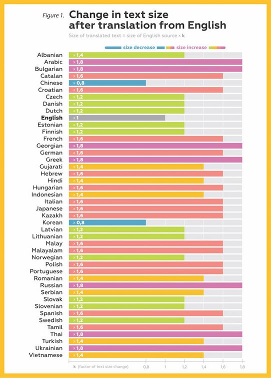
Figure 1: Change in text size after translation from English
“The data we have collected allows us to optimize internal processes, and our specialists follow them in their everyday work while constantly supplementing them. As we have documented the results of text size changes after translation for texts on different topics and of different lengths, what we present are averages. They are of practical value to us and help us foresee possible difficulties. This makes it possible to adjust a project workflow, allocate more time for document processing after translation or take future changes in text size into account at the document layout stage.”
Kirill Fedotov, COO, InText
The infographics which we previously published on our blog and on social media caught the attention of hundreds of followers, so we decided to share our observations on typographical factors influencing text size change in more detail. Once we started to obtain data about text size changes, the next step was to find the causes of and ways to solve the problems these changes create for desktop publishing, always with the goal of providing a high-quality end product.
Typographical reasons for text size change after translation
1. Text width change
When we talk about increases in text size after translation that are not caused by the change in the number of characters, we are referring to the following:
- Differences in the size of characters in the target language in comparison with characters in the source language
- Differences in the size of spaces between characters in the target language compared to the source language
2. Vertical expansion
This can happen when the target language has significantly taller characters than Latin characters. Also, some languages require more vertical interline spacing. For non-Latin languages, vertical expansion is often caused by a combination of both taller letters and more interline spacing. Numerous languages including Arabic, Thai, and Georgian have characters taller than those in Latin scripts.
Thus, we can see that in addition to the difference in the number of characters, the translated document is influenced by typographical factors as well. Indeed, their influence can be significant, as we can see with the example of Japanese: The number of characters decreases while the script is much bigger and the space between characters and lines needs to be larger. That’s why the target text requires more space. The situation is different with Chinese and Korean: These languages can be more compact (see Figure 2).
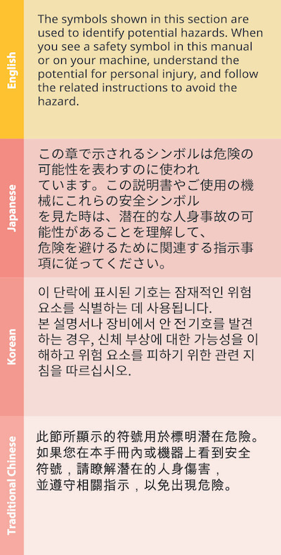
Figure 2: A sample translation from English into Japanese, Korean, and Traditional Chinese
It’s also important to mention languages with diacritics such as Czech, Latvian, Slovak, French, Romanian, Turkish, Vietnamese, etc. As a rule, diacritical signs do not influence vertical expansion of the text as they fit the standard interline spacing. However, it is impossible to reduce interline spacing in these texts if needed. This becomes obvious when working with uppercase letters that have diacritical signs, as in the case of Hungarian, shown in Figure 3.
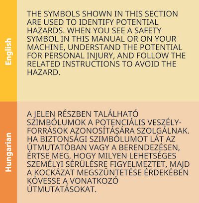
Figure 3: A sample translation from English into Hungarian
Other factors impacting desktop publishing
Apart from typographic factors and differences in the number of characters, other factors influence desktop publishing. A case in point is compound words found in Dutch, Finnish, German, and Thai, among others. For desktop publishing specialists, compound words may require changes in the layout, as it’s difficult to leave them on one line. In this case, correct placement of the text can become a serious challenge (see Figure 4).
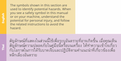
Figure 4: A sample translation from English into Thai
Each language has one or more of the above-mentioned peculiarities. However, if you know them, you can adapt your processes and be best prepared for any problems that may arise.
How to avoid issues with desktop publishing after translation
1. Consider future localization when creating layouts
“When working with documents, it’s quite difficult to create an adaptive and universal layout for all occasions. The main purpose of a document is to create a comfortable environment for the reader. This means that everything is clear and interesting. However, it’s possible to recommend that a designer take requirements for future localization and possible changes in text size into account. Sometimes, it’s possible to reach a balance. After all, this is the magic of design – many things are feasible.”
Oleg Ivanov, Art Director, InText
Moreover, it’s important to provide a high-quality layout by carefully applying text styles and working with illustrations. Don’t make excessive use of text in vector format, and keep in mind that images may also need to be localized.
2. Prepare original documents for translation
“Original documents with correct layouts may minimize or even eliminate problems after translation. Regardless of the software you use – Adobe InDesign, Adobe Illustrator, Adobe FrameMaker, Microsoft Word or others – it is important to check documents with desktop publishing specialists and to prepare them for localization if needed. For example, it’s important to apply correct styles throughout the document. This will simplify desktop publishing after translation. If the text size changes, the document’s structure will be preserved as much as possible. Then, at the post-processing stage, you just need to apply some of the techniques indicated below.”
Pavel Safonov,Head of Desktop Publishing, InText
It's important to check if the whole text is editable, if there’s any outline text (that has been converted into a vector format), etc. The text must also be prepared for translation with the help of CAT tools.
But if it turns out that you only have a non-editable PDF, high-quality optical character recognition (OCR) is needed to apply all the necessary styles in Microsoft Word. In this way, it is much faster and cheaper to correct any inaccuracies resulting from differences in text size after the translation is complete.
3. Translate with the help of CAT tools
CAT tools not only help to achieve higher translation quality and optimize translation costs but also make it possible to limit the number of characters, if required. This may be important, for example, for the translation of drawings, software user interfaces (also for equipment and vehicles), etc.
If you need to translate drawings in AutoCAD, it’s possible to export the text for translation in simpler formats, like Microsoft Word, then translate it with the help of CAT tools and import it back using macros. This requires just a few clicks instead of long manual work, which will reduce the costs of fixing the layout as well. After that, desktop publishing specialists will make sure the text fits the given space.
4. Fine-tune the final text after translation
If there are still inaccuracies after the document is formatted, the following techniques may be applied:
- Change inter-letter spacing for the text to remain readable
- Adjust leading (interline spacing)
- Change paragraph indentation (within reasonable limits)
- Transfer parts of the text from one page to another
- Change the font size (if previous options are not sufficient)
If the problem persists, it’s possible to develop variants together with designers in order to solve the issue in each specific situation. This last resort, however, is often not needed.
As you can see, working with the document layout is not only important but also quite interesting. After all, the main purpose of post-translation desktop publishing is to ensure that the end user does not feel like they are reading a translated document, but that the document looks like it was created for this specific user. This is the moment when the language barrier has truly been overcome. Ultimately, the real language of documents is the language of knowledge, ideas, creativity, and development.