
After conducting dozens of help site assessments for companies across industries, one pattern has emerged: Even the most well-intentioned documentation teams are unintentionally making it hard for users to get help.
Help sites are supposed to empower users to solve problems independently. But all too often, they overwhelm, confuse, or hide critical information behind clunky interfaces and outdated design choices.
The good news? Most of these issues are easy to fix with a handful of well-considered UX improvements. In this article, we’ll walk you through five of the most common usability problems found on help sites today and how to solve them.
1. Weak homepage design
Your homepage gives your first impression, and it should make things easy. When someone lands on your help site, they’re usually trying to solve a problem. Their mental load is already high, so your design needs to reduce, not add to, their frustration.
This is where the concept of cognitive load comes in: the mental effort it takes to process information and make decisions. Just like in learning, too much complexity in your interface creates unnecessary strain. If users can’t immediately see where they need to go or what they need to do next, they hit friction – right at the moment they need clarity the most.
What goes wrong:
- There’s no clear visual hierarchy. Everything looks the same, so nothing stands out.
- The search bar is buried behind a tiny magnifying glass icon or hidden inside a menu.
- The branding feels disconnected from the rest of the product experience.
How to fix it:
- Use clear, consistent visual cues to guide users toward popular or critical actions.
- Make search prominent – top center or top left – and easy to find at a glance.
- Match your help site’s branding to your product or marketing site to create a seamless experience.
- Include obvious starting points like “Getting Started” or “Top FAQs” to reduce friction.
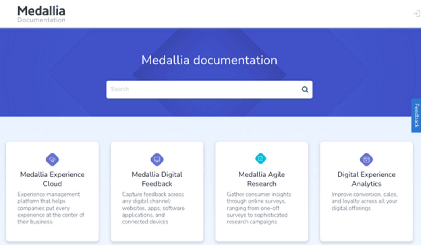
Medallia’s documentation site, a CODiE Award finalist, is a great example of how simplicity – paired with strong visual hierarchy – can be incredibly effective. It’s proof that you don’t need a flashy design to deliver a powerful, user-friendly experience.
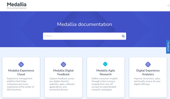
Figure 1: Medallia’s documentation site has prominent search and clearly defined paths to information using product-based tiles.
2. Poor performance
Even the best-designed help site will lose users if it’s slow to load – especially on a mobile device. According to Heretto’s 2024 State of Customer Self-Service report, nearly half of all help site traffic comes from mobile devices. Yet, mobile performance is still one of the most overlooked aspects of the user experience.
Speed isn’t just a nice-to-have. It directly impacts your SEO, your bounce rates, and how satisfied (or frustrated) your users feel the moment they need help.
What goes wrong:
- Heavy scripts or large images slow down the experience, especially on mobile devices.
- Pages lag or freeze, especially during key interactions like loading articles or submitting feedback.
How to fix it:
- Use tools likeGoogle PageSpeed Insights to pinpoint what’s slowing your site down.
- Optimize your images and video assets, and make sure they’re loading responsively.
- Implement caching strategies and lazy loading to improve performance.
- Prioritize mobile-first design, ensuring to test how your site performs on various screen sizes and connections.
3. Confusing navigation
If users can’t quickly figure out where they are or what to do next, they’re more likely to give up than dig deeper. Common pitfalls include too many clicks to reach content, dead-end pages that force users to backtrack, and cluttered layouts that overwhelm rather than guide. Navigation should be smooth, intuitive, and above all, predictable.
What goes wrong:
- Navigation menus use inconsistent or unclear labels.
- There’s no persistent table of contents (TOC), sidebar, or breadcrumbs to show users where they are in the hierarchy.
- Articles don’t link to related topics or next steps.
How to fix it:
- Build intuitive navigation menus with a predictable structure and clear terminology.
- Use a persistent TOC, sticky navigation, or breadcrumbs to orient users.
- Add contextual links like “See also” or “Next steps” at the end of articles to guide deeper exploration.
4. Hard-to-find support options
Not every issue can be solved through self-service – sometimes users just need to talk to a human. And we’ve all experienced the added frustration when finding that path is harder than it should be. If a customer has already tried to solve the problem on their own, the last thing you want is to make them jump through hoops to get additional help. When they’re ready to escalate, the process should be obvious, quick, and frictionless.
What goes wrong:
- Support options are buried deep in the footer – or worse, hidden behind a login.
- There’s no clear fallback when search results turn up empty.
How to fix it:
- Make it easy to find support options within 30 seconds of landing on your site.
- Add visible CTAs to “Contact Support” or “Submit a Ticket” in logical places – like sidebars, footers, and article headers.
- Create a smooth handoff from content to conversation, whether that’s live chat, email, or a support portal.
5. Lack of personalization
Users today expect more than static, one-size-fits-all pages – they want content that feels relevant to them. That means seeing information tailored to their specific role, product version, and even their level of access or permissions. For example, an admin and an end user shouldn’t be served the same setup guide. Someone using Version 2.0 of your product shouldn’t have to sort through outdated instructions from Version 1.4.
As personalization becomes the norm in digital experiences, help sites that fail to adapt risk frustrating users and eroding trust. Smart content filtering and dynamic delivery aren’t just nice to have – they’re essential for delivering the right answers to the right people at the right time.
What goes wrong:
- Everyone sees the same content, regardless of role or product tier.
- There’s no personalization post-login.
How to fix it:
- Use login-based personalization to filter content based on the user’s product, subscription level, or persona.
- Implement conditional content that adapts based on user context (e.g., admin vs. end user).
- Offer dynamic search filters or landing pages that adjust based on user behavior or role.
Small changes, big impact
A truly helpful help site is more than just a searchable database – it’s a dynamic, user-centered experience that anticipates needs, reduces friction, and empowers users to succeed on their own. The good news? You don’t need to overhaul everything to see results.
Small, strategic UX improvements – like faster load times, clearer navigation, and more personalized content – can have a massive impact on both user satisfaction and support efficiency. When your help site works with your users instead of against them, it becomes more than a support channel… it becomes a competitive advantage.
Want a second set of eyes on your help site?
Sign up for a free Help Site Assessment and get:
- Personalized feedback on usability and content
- Best practice examples tailored to your site
- Practical, pressure-free guidance from experts