To make processing visual information as easy as possible, it helps to understand the user's psychological and cognitive processes. These are as much a product of social conventions as they are innate reflexes, and being aware of them means you can apply certain principles to produce visual content that is tailored to the user's needs. And that requires graphics that are intuitive and easy to understand.
Force of habit
Our brain favors habits and familiarities. It can process recurring, consistent information more easily, which also means more quickly. This also applies when we process visual content. The more familiar we are with how something looks, the quicker we can identify abstract versions of it. For example, we don't have to be able to read every letter on the page to know the layout of a newspaper. We don’t need to look at every detail of a website to recognize a media player. We can do this because of the habits we have developed based on learned conventions. Throughout life, patterns and macrostructures help us make quick connections, get our bearings, and find and understand information efficiently.
Familiar patterns are the perfect foundation for designing both simplified graphics and user interfaces that guide the user’s focus and promote “intuitive” software use. While this can be an advantage for users, sometimes this principle can be deliberately deployed unethically. Who hasn't fallen for a “dark pattern” when visiting a website and hastily accepted more cookies than needed? In fact, who even knows what they’re accepting when they do it? There was only one clickable option to continue – wasn't there (see Figure 1)?
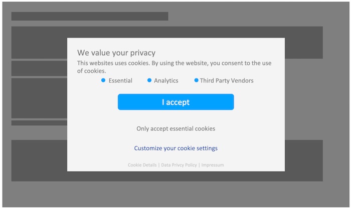
Figure 1: A typical cookie banner that tries to lure users into clicking “I accept” is a good example of how dark patterns are used in UX design
© Leonie Saremba/Anton Bollen
Culture can also have a significant impact on conventions. Think about the direction we learned to read in – it shapes the way we structure and scan visual information. Or think about different cultural connotations of colors, or how the granularity of shared information varies. The list is endless.
So, how did standardized conventions, such as a newspaper’s layout, the structure of a letter, or the look and feel of a user interface become so widely established? To answer this question, let's take a deep dive into the cognitive and psychological factors involved in the way we perceive and process visual information.
Understanding and guiding perception
Closely related to the Gestalt laws, the following section outlines profound aspects of how visual information is perceived.
Figure and ground
When we look at a graphic, we instinctively work out the foreground and the background. This is an automatic cognitive process, and it also works with the various layers of a graphic. There is, however, a very fine line between making the distinction naturally, immediately, and “effortlessly”, or, on the contrary, having to concentrate and analyze a very complicated element. Reversible images demonstrate this principle in a fascinating way. They are a good example of what not to do when designing simplified foregrounds and backgrounds. At first glance, a reversible image might look like a young woman; then, when we look again, our understanding shifts, and an old woman comes into focus.
So, when creating simplified graphics, it is important to avoid nesting information in multiple layers. Instead, content that conveys information needs to be expressed through simple basic shapes. In this way, designers draw on natural cognitive processes that take place when viewing graphics.
Proximity
If some elements of a graphic are close to each other, users perceive these elements as belonging together. This is the Gestalt principle of proximity. This instantaneous process of interpretation has significant implications for how to arrange visual information within a graphic. Using this principle, designers can visually represent groupings and associations of elements simply by placing them close to each other. Users will perceive them as columns, blocks, rows, or other kinds of groups.
Symmetry
We rely on symmetry to orient ourselves, around either a point or an axis. This does not mean all our simplified graphics have to be symmetrical works of art. All that users need to efficiently get their bearings are visual elements neatly arranged around a shared axis or a certain reference point. Let's try a thought experiment: how long and intensively would you have to search for a face in a randomly positioned crowd on a photo? It's much easier when you have a fixed grid layout of portraits, isn't it?
Similarity
Users perceive similar-looking graphics as being related. According to the Gestalt theory of psychology, this is because we’re always trying to establish meaningful relationships between objects. This principle can be used when creating graphics, for example:
- By using color coding and accompanying legends.
- By ensuring that any elements that convey information look similar.
In doing this, designers can make their graphics seem neutral, and reduce visual noise to a minimum.
Anomaly
As we have just learned, when it comes to perception, the human mind is always establishing relationships, comparing elements, and finding its bearings. It is also processing any informative content, so if any tiny detail slips out of line, our attention is drawn to exactly this. In short, the secret to guiding focus lies in steering the user’s attention by using anomalies, such as:
- Accent colors
- Different shapes and positions
- Different alignments and fonts
The key point is that anomalies must be used consciously, in a targeted way and, above all, sparingly.
Connectivity
When elements in a graphic are directly linked by lines, users will perceive them as connected. Once you are aware of how powerful this effect is, you can visually represent connections and sequences using very simple techniques. However, it is important to remember that less is more.
Theory in action
Figure 2 shows the above-mentioned perception principles in use. The original diagram on the left is a perfect candidate for revision: The significance of the shapes and colors is unclear, and the information is not presented with a fixed data model such as a UML diagram or a flowchart. The shapes are not aligned, and the connections are not mapped out symmetrically. The simplified diagram on the right is still quite complex. Nevertheless, it is easier to perceive because it uses identical shapes, fewer colors, and a legend for further information. This symmetrical graphic helps users find their bearings quickly because the graphic itself supports the naturally triggered cognitive and psychological processes we use for information processing.

Figure 2: Comparison of the original diagram on Wikimedia Server Architecture (Wikipedia, 2003)(left) and its simplified version (right)
© Leonie Saremba/Anton Bollen
Switching from classic screenshots to simplified user interface graphics
Even screenshots can be made clearer, simpler, and more efficient if they are designed using the perception principles discussed here, for example, with simplified user interface (SUI) graphics.
In SUI design, user interfaces and other content (e.g., web content) are reduced to the essentials, and unnecessary elements are removed or abstracted. Text and visual elements that aren’t relevant are reduced to simpler shapes (e.g., rectangles to represent text). The user will only be able to see the elements they need to understand the text. This results in a stylized, yet immediately recognizable image of the user interface (see Figure 3).
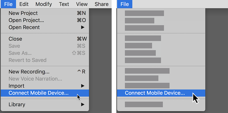
Figure 3: The user interface is shown in a simplified form; all details relevant to the instructions are clearly visible
© Leonie Saremba/Anton Bollen
Since 2013, this design style has been cropping up more and more in marketing and software documentation, and it has been adopted by technology companies such as Microsoft, Dropbox, and Google. Today, simplified graphics have become prevalent across many areas of business communication. They are also increasingly used in onboarding, training, and marketing content, both as regular images and in small animations. The advantages of simplified design really come into play here: they are easy to understand, future-proof, and language-neutral.
SUI graphics: Why they work and where to use them
In the following section, we discuss specific advantages and possible applications of SUI graphics.
Modern design meets easy understanding
SUI graphics are clear, contemporary, and visually appealing. Because users only see the menu items or commands that are required for the instruction, SUI graphics contain less visual noise than normal screenshots. This can be seen in the eye-tracking experiment in Figure 4.
With SUI graphics, the relevant information is in the foreground, so the user’s focus is drawn right to it. Removing distracting and irrelevant menu items reduces the user's cognitive load so they can understand the content more easily. This allows users to process and follow the information more effectively.
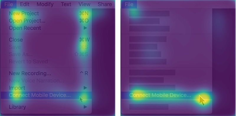
Figure 4: Comparison of eye-tracking heat maps for a classic screenshot (left) and a simplified screenshot (right)
© Leonie Saremba/Anton Bollen
Future-proof
Because SUI graphics show an abstract user interface with fewer concrete details, they can often still be used even after the software is changed. Consequently, SUI graphics remain up to date across multiple versions and need to be changed less frequently. This is a major benefit for using simplified screenshots in documentation, especially in cloud environments with rapid update cycles.
Sometimes, SUI graphics can even be used in different versions of platform-dependent software because of their abstract form.
Smoother localization
By reducing or getting rid of text, SUI graphics simplify the localization process or even remove the need for image localization altogether. Because of this enhanced reusability, the same SUI graphic can be used for all localized texts. The relevant instructions can then be conveyed in the text or through image captions. Microsoft and Adobe have embraced this approach in their documentation and onboarding content.
Practical tips and best practices
Both simplified and SUI graphics can be created using any graphics software. The following tips and best practices are recommended for their effective design.
Boil it down to the essentials
Simplified graphics can represent very complex elements without losing focus on the key message. You can safely omit any peripheral details, design elements, or additional information that are irrelevant in the context.
Simplified graphics work particularly well with fewer layers. In many cases, one foreground element is enough. Too much nested information is a good first sign that a simplified graphic has strayed from its key message.
As with all screenshots, it helps to crop the image so that the action being shown is in the center.
In both classic screenshots and SUI graphics, irrelevant buttons, menus, and tooltips can be removed or reduced.
Keep a clear link with the original user interface
One important aspect of SUI graphics is the way they mirror the original user interface. The design of the SUI graphic needs to be based closely on the design of the source interface so it can easily be recognized and processed. The following tips help with the simplification process:
- For SUI graphics, the basic shapes that are used to represent relevant content should reflect the hierarchy of the elements on the screen, i.e., thicker bars for headlines, thinner ones for running text, blank boxes for images, etc.
- Visual anchors, such as icons, stand-out buttons, and menu titles can be left as they are to help orient the user.
- If the instructions refer to a specific element directly, it should be recognizable and set apart from the rest of the simplified user interface graphic.
Make your visuals consistent
Set out and follow some design rules to ensure consistency across simplified graphics in your software documentation. To make adhering to these rules easier, you could document them in a style guide. These rules should address:
- Rules for horizontal and vertical alignment of elements
- Rules for positioning and spacing of elements
- Rules for consistent sizing of elements
- Set usage of additional graphic elements, e.g., icons or pictograms
- Fixed number of layers
- Fixed preferences for element shapes
- Fixed line thickness
- Fixed color palette
Pick the right colors
A significantly reduced color palette works best for simplified graphics. All you need are two or three highly saturated accent colors for the foreground and one or two gray tones for the background.
The background colors of digital simplified graphics should reflect the background colors used in the output. For black backgrounds, use very dark gray tones; for white backgrounds, very light gray tones. If cross-media publishing leads to two different design schemas (e.g., a mix of dark and light tones), the best solution is to adjust the reduced color palette to suit both use cases.
In some cases, simplified graphics require color coding. Whenever needed, this should always be accompanied by a legend and an explanation. If it then turns out that a legend is not necessary, you know that you do not need any other colors, so the same color can actually be used for all the elements. Any noticeable difference will lead to more intense cognitive processing and interpretation.
Standardize your work environment
Depending on what software you are using, it may be possible to apply templates. Templates, building blocks, and repeatable color themes make it much easier to ensure consistency across simplified graphics and SUI graphics in your software documentation. Many of the consistency rules specified above can be implemented in templates before the design process even starts.
Where possible, it is a good idea to appoint one team member as the resident expert for simplified graphics and screenshots. This will make it a lot easier for team members to learn about editing software and SUI graphics while also providing an expert-based peer review system.
These recommendations should work effectively for most editing programs. In case you are looking for a more convenient solution, Snagit by TechSmith is a specialist tool for simplifying screenshots. This tool partially automates the process of creating and adjusting SUI graphics with a consistent color palette.
Keep your graphics simple!
Countless factors influence the way we perceive graphics and screenshots – on a conscious and subconscious level. They also give us a clear indication of what is easy to understand and simple to create. While the design techniques outlined in this article optimize the way information is conveyed and understood, many other approaches are similarly efficient. Because what it all really comes down to is one straightforward message: Keep your graphics simple!