Once considered primarily a written domain, technical documentation is becoming more visual, particularly on the web. This movement towards visual documentation is mainly fueled by today’s users, who represent a global audience and don’t have time to read in an age of information overload.
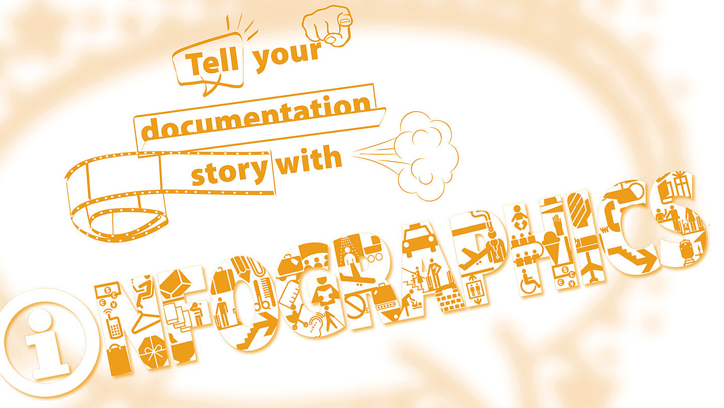
Technical communicators can adapt to the changing user expectations by producing more infographics and data visualizations in their documentation. Special graphic design tools are not necessary. Microsoft PowerPoint, which is generally accessible to technical writers, can be used to create infographics that adhere to the company brand and standards of professional online publication. This article describes the basic infographic types in end-user documentation, and provides tips for technical communicators to plan and create their own infographics.
By making information easy to understand, visual documentation allows users to have a much improved customer experience.
What is an infographic?
An infographic is a visual representation of data, processes or concepts. By breaking down a complex mass of information into its component parts and relationships, an infographic conveys essential data in a clear and meaningful format. A simplified visual schema is usually easier to understand than a long chunk of text.
Infographics are part of the data visualization trend, which represents quantitative information in the visual form of graphs, tables, charts, maps and dashboards. Data visualization allows people to see trends and patterns in data. In recent years, data visualization (#dataviz) has become a common sight in news articles, social media, and in almost every industry that produces digital content. If visuals are so widely used today, why not use them more in end-user documentation?
Unlike data visualization, infographics don't only visualize quantitative data. Infographics aim to simplify complex information, making it easier to understand. This includes processes, hierarchies, concepts and flow charts – all of which are part of end-user documentation.
What is the aim of an infographic?
A good infographic aims to tell a story. The story is reflected in the infographic’s title, and is preferably embedded in the infographic. When the title is loud and clear, there’s no doubt as to what users are looking at. If an infographic contains more than one story, it should probably be broken down into two or more infographics.
In an infographic, data and concepts are visualized as building blocks. This helps to focus on the main elements. When there are many smaller objects with a common function, they can be grouped in a single building block to provide clarity. To help focus on the infographic’s story, any unnecessary or peripheral elements that clutter the graphic should be removed.
According to the visual principles of Gestalt, the human mind aims to perceive everything in its simplest form. If an infographic meets these criteria, it’s doing its job by conveying complex data in a simplified way:
The infographic
- tells one story only, as reflected in the title;
- contains clear and logical elements;
- groups building blocks logically, and
- doesn’t contain clutter, extra or unnecessary information.
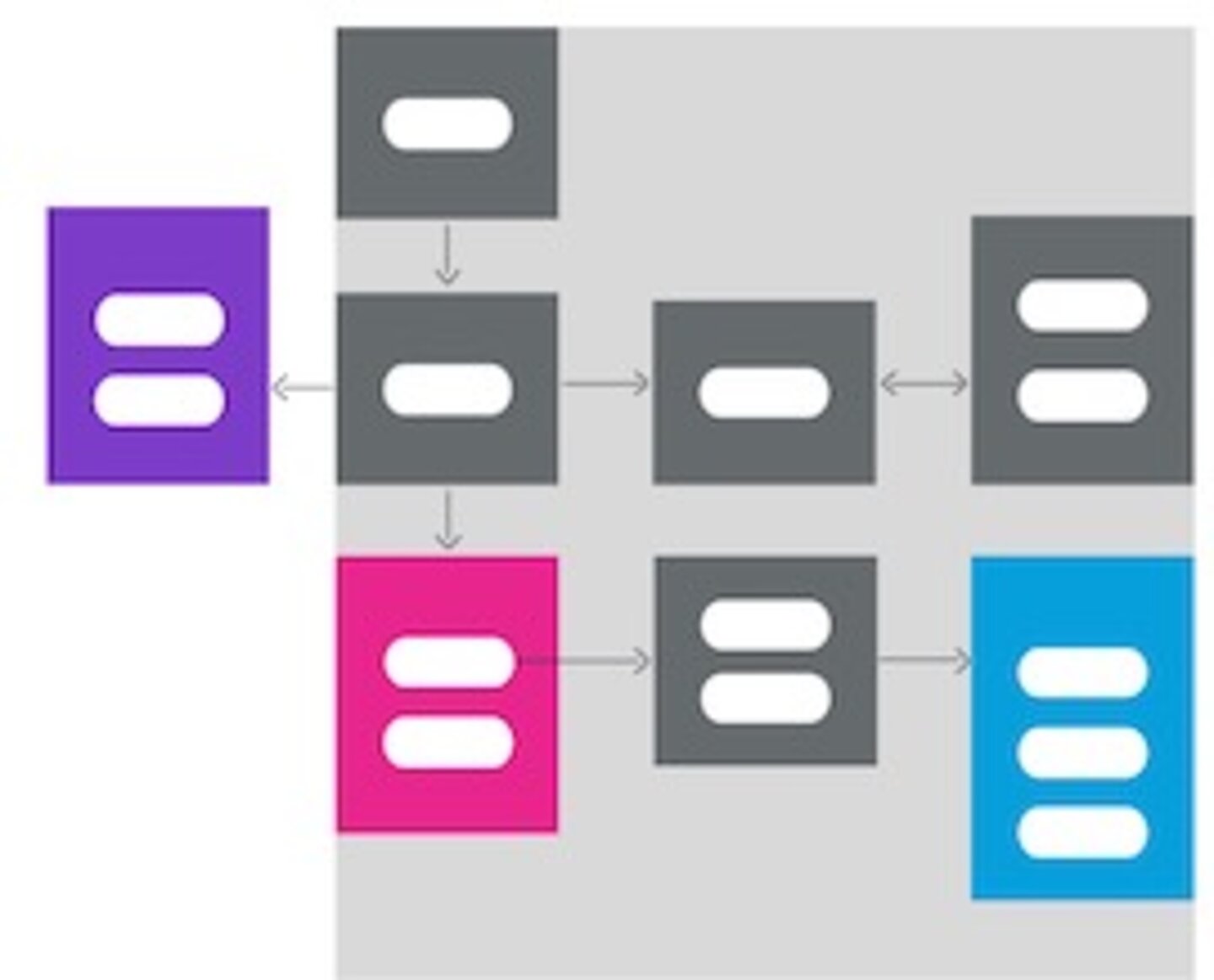
Figure 2: Thebuilding blocks of an infographic: Elements in this architecture infographic are grouped according to similarity (sub-processes are in the same element), and difference (different colors indicate specialized functions). The flow of information between the elements is indicated by arrows.
Reasons to use infographics
The reasons to use infographics can be divided into two groups: cognitive reasons that explain why images receive processing preference over text, and today’s technological context.
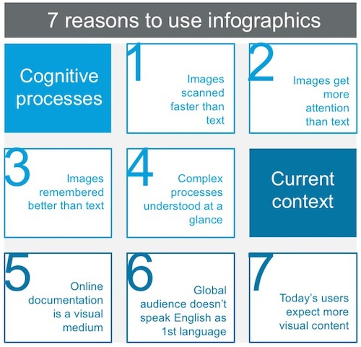
Figure 3: Why images are useful in your documentation
1. Images are scanned faster than text
In 2014, MIT neuroscientists discovered that the brain can identify images seen for as little as 13 milliseconds. That’s superfast compared to the average time taken to process a letter of the alphabet (476 msec) or a word (441 msec). This rapid processing speed for images means that readers can identify and start to understand an infographic before reading any text.
2. Images get more attention than text
Using eye-tracking equipment that produces heat maps, the search engine optimization (SEO) company Moz studied users as they viewed Google search results.
The aggregated heat map shows that a search result with an image attracted much more attention (yellow area) than a search result without an image (red area). In end-user documentation, this means that readers are more likely to focus on infographics – and not text – as their anchor.
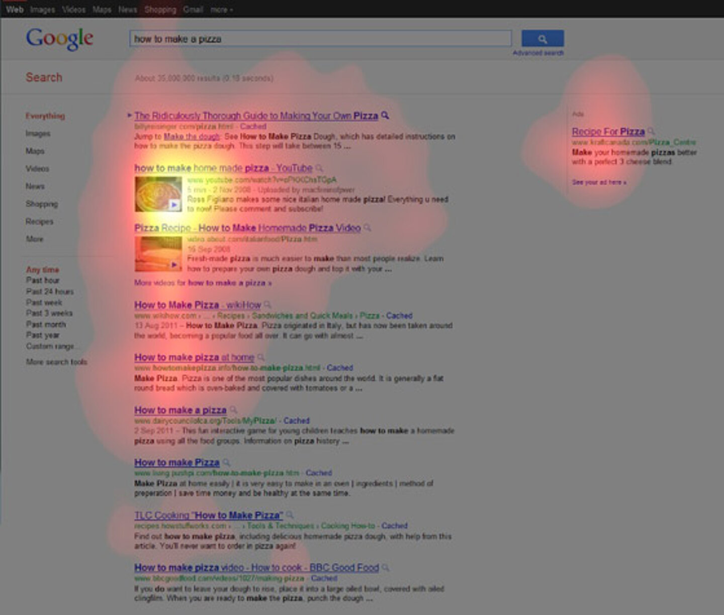
Figure 4: Search results with images gain more viewer attention.
Source: https://moz.com/blog/eyetracking-google-serps
Copyright 2020 © Moz, Inc.
3. Images are remembered better than text
Most people can remember images better than words. This is also known as the picture superiority effect. Researchers found that people remember information much better when text is combined with a relevant image. They presented subjects with either words (as a text or audio recording) or with images including text labels. After three days, subjects exposed to words alone could recall only 10% of the words presented to them. However, those who had been exposed to images in combination with text could recall 65% of the words.
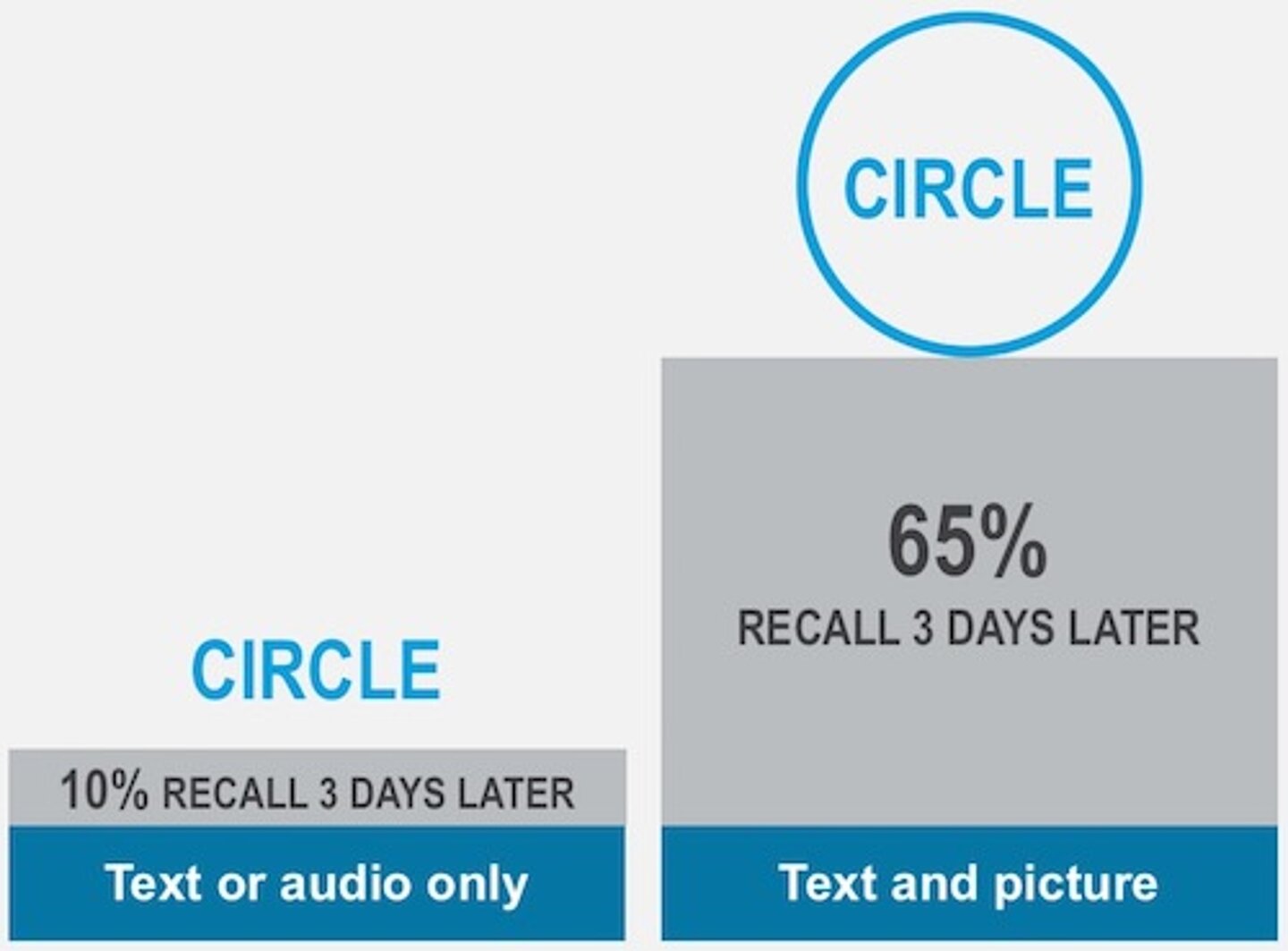
Figure 5: The picture superiority effect suggests that images with words are recalled better than text or audio alone (Nelson, Reed and Walling)
4. Complex processes are understood at a glance
Last year, it was estimated that 2.5 quintillion bytes of data are created each day. As data growth accelerates exponentially, it becomes more difficult to manage, use, and interpret data. For readers to make sense of complex data, it needs to be simplified, especially when complex procedures and contingencies are involved.
This is where infographics fit into documentation. By breaking down a complex mass of information into its component parts and relationships, infographics convey the essential data to the reader in a clear and understandable format.
5. Online documentation is a visual medium
With the advent of online help, technical documentation has changed dramatically from traditional PDFs in both format and content. Online help is a visual, interactive medium that is saturated with graphics and videos. Infographics are naturally suited to a visual medium, and can be hyperlinked as image maps that allow users to jump to the relevant help topic.
6. The majority of users are not native English speakers
About half of all web content is in English. However, only around 20 percent of the world’s population speak English at all, and only five percent speak English as a native language.
When writing documentation for a global audience, we need to bear in mind that most users are probably not native English speakers. Infographics, especially when they use icons, appeal to a global audience because they help to overcome the language barrier.
7. Today’s users expect more visual content
It’s not only the documentation medium that has changed. Users’ reading habits and expectations have also changed. It’s known that reading requires cognitive effort, and people prefer to exert less effort, so they tend to skim to find what they’re looking for. In today’s age of TMI – too much information – people are bombarded with information and barely have time to read or process what they are reading. Customers find that infographics help them to understand technical information, and often request more infographics on customer feedback surveys.
Infographic types in documentation
In end-user documentation, there are three basic types of infographics: workflow, data flow, and concept. All three infographic types help to simplify complex information.
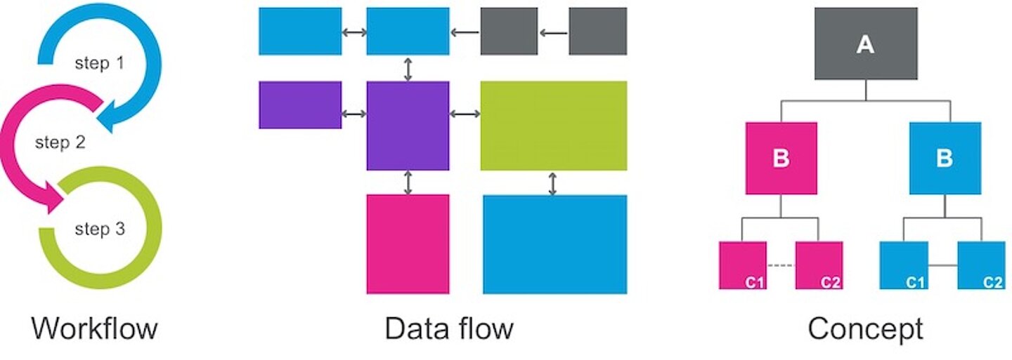
Figure 6: The three types of infographics
Workflow infographics
To give users a bird's-eye view of an ordered procedure that spans several topics, use a workflow infographic. It’s not necessary to use an infographic for a numbered list of a specific procedure. Save the infographics for the more complex processes that are made up of several procedures.
Examples of workflow infographics include:
- How to install an entire solution or product
- How to install a complex feature
- How to perform any complex sequence of end-user procedures
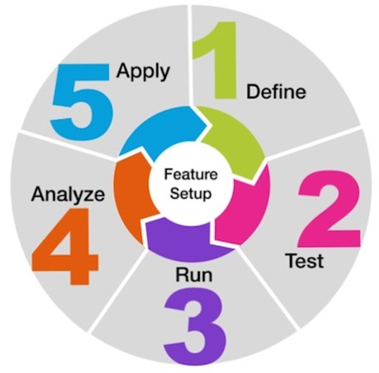
Figure 7: Circular workflow infographic. A circle is used if the workflow can be recalibrated or repeated when the user gets to the end of the process.
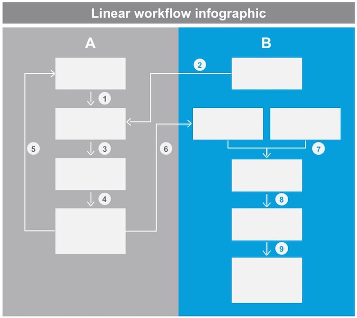
Figure 8: Linear workflow infographic with numbered legend. Complex processes are elaborated in the body text.
Data flow infographics
A data flow infographic is a simplified representation of information flow. It does not replace a technical specification diagram. Detailed technical diagrams for developers (usually produced in Visio) should remain as technical diagrams, as they are too detailed for infographics.
Examples of data flow infographics include:
- Architecture
- Decision-making flow chart
Data flow infographics use symbols, such as connectors and arrows, to represent the direction of information flow.
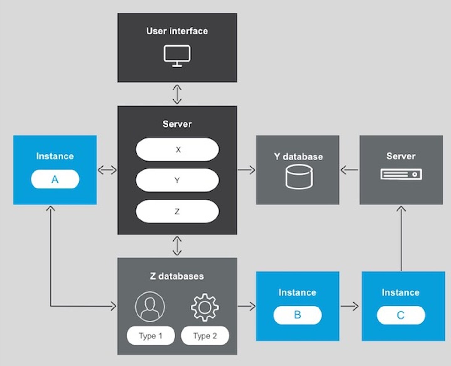
Figure 9: Data flow architecture infographic. There is no defined start or end point in a data flow, as information is processed in parallel
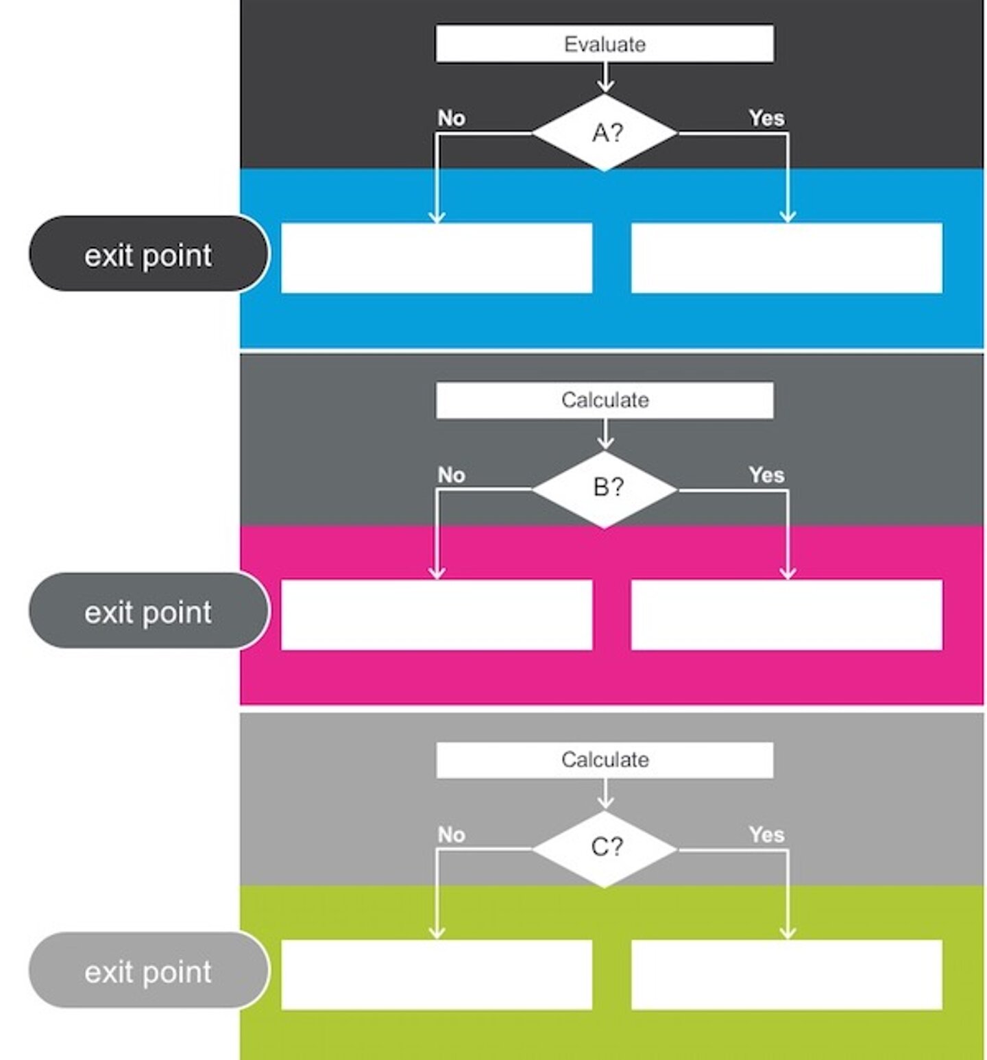
Figure 10: Data flow decision-making infographic. This infographic of exit points shows how a visual representation can be recalled better than a chunk of text. Complex information is simplified as a decision-making flow chart that can be understood at a glance.
Concept infographics
A concept infographic is a visual representation of functionality or any idea. If your documentation includes any complex concept that can be communicated visually, then it’s a good candidate for an infographic.
Examples of concept infographics include:
- Gamut of solution features
- Functionality of a specific feature
- Hierarchy

Figure 11: Concept infographic. A feature is depicted visually so it is understandable at a glance.
Planning an infographic
Before diving into the design of an infographic, it helps to clarify exactly what information you want to convey. For very complex information, it’s imperative to try to separate the main message from the details. Some questions you might want to ask when planning an infographic:
- What type of information are you describing?
- Quantitative – When numbers have significance, they should appear prominently in the infographic; for example, in a workflow of sequential processes.
- Qualitative – Text in an infographic should be clear, concise and legible. Even when elements are represented visually as building blocks or with icons, they still need text labels for clarity. Readers should not have to guess what an element represents.
- What type of infographic best suits your content?
- Workflow – Is the workflow linear or circular? A linear workflow is performed in sequence from start to finish. A circular workflow is a sequential procedure that can be recalibrated and repeated.
- Data flow – Depicts a flow of information, such as an architecture diagram, where arrows represent the direction of information flow.
- Concept – A visual representation of functionality or any idea, such as the features of a solution.
- What story do you want to tell?
The story of an infographic should be summarized in its title, which should be prominently displayed and preferably included in the infographic. Many infographics have a clear beginning and end. Arrows or connectors should show the flow from beginning to end. - How do you represent the elements?
Each element in an infographic can be represented as a building block – a shape that’s labeled with text indicating what it represents. Smaller or detailed elements can be grouped into one element. Repetition of the same shape can indicate the same kind of element. Color can be used to differentiate between different types of elements. The layout of the elements reflects their relationship to each other. Icons – a universal language of symbols – can be added to elements for added value but should not replace text. - How to avoid clutter?
Beware of “too much information” (TMI) in an infographic. If there is TMI, consider telling another story in a different infographic. When focusing on the main story, only include the absolutely essential elements. Don’t put anything that is unnecessary or considered noise. Instead of enhancing the infographic, clutter confuses the reader and makes an infographic harder to comprehend.
Conclusion
In this age of excess information, it can be difficult for users to understand complex technical documentation. Infographics help communicate complex information in a visual way that is easy for users to understand, facilitate usability, and promote an aesthetic experience. When users are engaged with documentation that is clear, understandable and looks good, their experience is more likely to be positive.
Producing infographics for documentation is a highly valued capability that technical communicators can add to their skill set. Technical communicators don’t have to replace all text with graphics, but they can start thinking visually and leverage infographics to complement the text. Your users will thank you for it.
References
- Data Never Sleeps. Domo, Inc. 2011 [cited March 8, 2020]
- Kahneman, Daniel. Attention and effort. Vol. 1063. Englewood Cliffs, NJ: Prentice-Hall, 1973.
- Lyons, D. "How Many People Speak English, And Where Is It Spoken?"Babbel Magazine, 2017.
- Meyers, P.J. "Eye-Tracking Google SERPs – 5 Tales of Pizza". Moz, Inc. Oct 5, 2011 [cited Jan 21, 2020]
- Nelson, Douglas L., Valerie S. Reed, and John R. Walling. "Pictorial superiority effect." Journal of experimental psychology: Human learning and memory 2, no. 5 (1976): 523.
- Potter, Mary C., Brad Wyble, Carl Erick Hagmann, and Emily S. McCourt. "Detecting meaning in RSVP at 13 ms per picture." Attention, Perception, & Psychophysics 76, no. 2 (2014): 270-279.
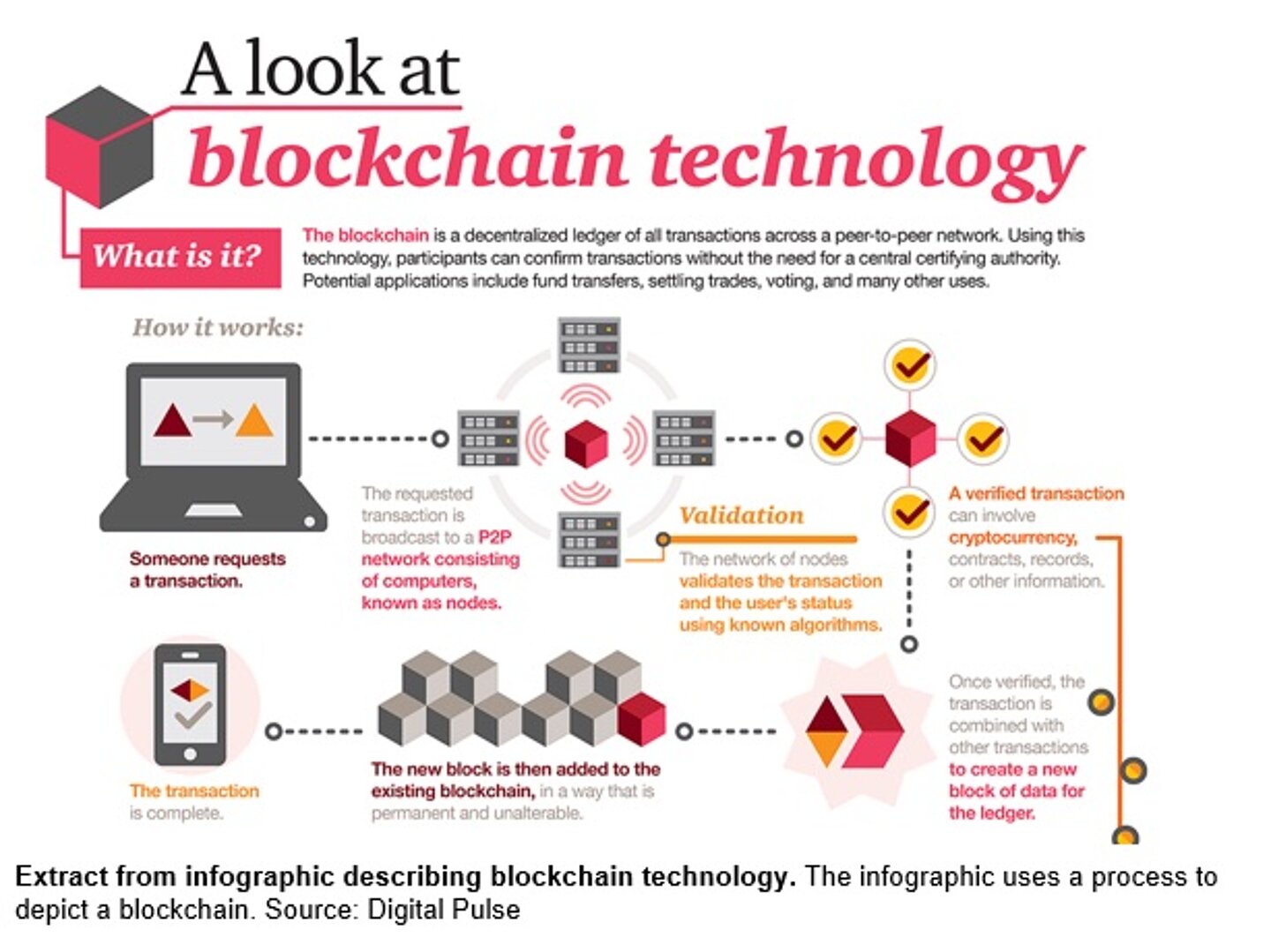
- Shipman, John. Infographic: Blockchain explained. Digital Pulse, 2016.