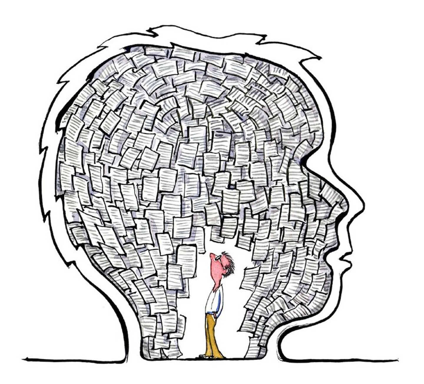
For millennia, imagery has been a central part of how facts are communicated between people and generations. It is only in the last 500 years that text-based language has taken over. But over the last few decades, we have witnessed a return to visual communication through image and color.
But how do we know that people perceive the same thing through images? Are there cultural differences that alter the meaning of images in different parts of the world? Do images need to be translated even when they do not contain text? Let me show you some examples of how people interpret images in different ways.
Replacing text with images to convey information has become commonplace. Visual information significantly reduces translation costs but, more importantly, it lets us handle large amounts of information quickly and easily.
IKEA's image-based manuals for assembling furniture have become a bit of a model here. IKEA uses very simple step-by-step instructions that are displayed in the form of a "non-human" figure. These image-based manuals reach a very broad target group, as the furniture and appliances retailer has stores all across the world. Image-based manuals are not dependent on language but can be perceived and understood by individuals of different linguistic and cultural backgrounds. But is it the ultimate solution? Is the information clear enough for everyone to understand? Is it really as simple as replacing text with images? How do we know if people in different parts of the world perceive the information in the same way?
Cultural differences
There are a lot of cultural differences that affect the information we produce and, for us who work with disseminating information, we need to keep these in mind. Here are some cultural differences that might change the way our audience interprets our information:
Reading direction
Not all languages are read from left to right, and this also impacts the way visual information is perceived. In the example in Figure 1, a picture in three parts shows how a mother gives her child a pill. In the first picture, the child is sick, in the second the child is given a pill, and in the third, the child feels happy again. But in a right-to-left culture, this is perceived as if the mother has a happy child to whom she gives a pill, making the child sick.

Figure 1: Reading direction matters, even in images.
Reading information upside down
With no written language, we cannot know which direction is up or down. Symbols are usually independent of the horizontal reading direction, but how do you know which way is up and which is down if no text indicates this? Figure 2 gives an example of symbols and icons that can be misinterpreted when read upside down.

Figure 2: Which way is up?
Symbol 1: Picture of glass
- Correct meaning: Fragile content, protect against shocks.
- Upside-down interpretation: Is that a chair? Why does this crate have a chair? Could it be a throne? Must be important!
Symbol 2: Two arrows pointing up
- Meaning: The arrows point upwards to show which side should be up.
- Upside-down interpretation: Two spears with the tip down.
Symbol 3: Umbrella
- Meaning: Protect the box from moisture.
- Upside-down interpretation: Is it a fishing net?
Interpreting information
The way we interpret information can also impact our emotions. Considering that people are very different around the world, there is a lot that can be misunderstood. When designing visual information, we usually reflect our own experiences in the image we produce. Illustrating a person that just about all people around the world recognize themselves in is a huge challenge.
There is even a risk of offending people. As an example, think of a hand with a ring on it. This leaves room for questions and interpretations: Is that person married? Isn’t it boastful to show this ring in that way? Is there anything shameful about being unmarried? The interpretations can be manifold and vary between cultures. Another side effect is that the attention is drawn away from the message the image is trying to convey.
 Figure 3: The non-human
A solution to this can be figures with, for example, four fingers only, which is less likely to be compared or connected with a human hand. In this way, the hand becomes "inhuman". IKEA, for example, uses a figure without fingers or with only a few, see Figure 3. Despite this figure being “non-human”, the user still identifies with it and understands that they will have to do the steps that the figure shows. By using such a figure, we can avoid negative misinterpretations.
| “Use a picture. It's worth a thousand words,” wrote newspaper editor Arthur Brisbane in 1911 in an article on journalism and publicity. The modern version "A picture is worth a thousand words" symbolizes how to convey a complex idea with just a single image. It also marks one of the most important goals of visualization, namely, to make it possible to perceive and understand large amounts of information quickly. |
Colors and cultures
Research suggests that there is a great difference in the way people around the world perceive colors. How does this affect the image-based information we create? And what are the cultural differences with regard to colors?
Neurologist and researcher Beau Lotto claims that colors do not even exist, but are illusions that arise in the brain to help us see the world in a useful way, that is, to help us survive.
Similarly, Professor Jay Neitz from the University of Washington has spent 30 years studying the way we see colors and how they affect us and our emotions. Neitz says that our original color system was yellow and blue only. This is because the first unicellular organisms took shelter in the water when the UV rays from the sun were too strong, and then came to the surface later in the day when the sun's rays were more pleasant and not harmful. Thus, these organisms learned to interpret the colors yellow and blue to ensure their survival.
Neitz further suggests that it was about 40 million years ago when monkeys developed a new eye structure that allowed them to see and understand the colors red and green. The reason for this evolutionary development was to separate leaves and plants from fruit and berries. Neitz says that "colors allow us to see similarities and differences between surfaces based on the full spectrum of light that they reflect."
Tests have been conducted on children to see whether their ability to understand and perceive colors is affected by language and if language and color vocabulary are connected. By calibrating the children's eyes against a computer screen, it showed how the brain and vision reacted and processed the information.
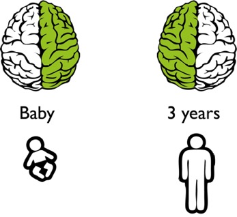
Figure 4: Colors are processed in different parts of the brain, depending on age.
The first test person was Max, who was still a baby and had not yet developed a language. Newborns have limited color vision, which develops during the first three months. When Max performed the test, it showed that he used his right hemisphere to process the color categories. The right hemisphere is central to our imagery and sense of form. The next test person was 3-year-old Noah, who had already developed a language. When Noah performed the test, it showed that he used his left hemisphere, which is dominant in language, to process the colors. These tests used the most common color vocabulary that includes these eleven colors:

But not all people on earth use the same color vocabulary. So, how do we know if people see and perceive the same things? How do we know that the information that goes from text to image becomes clearer if people not only speak different languages but also have a different color vocabulary? The results from these tests suggest that the learning of language and colors is coherent, because the tests showed that the knowledge of colors was transferred to the left hemisphere once a language was learned.
Researcher Sorsjegy Kaparós studied the diverse color vocabulary of different cultures and backgrounds. To do so, he traveled to Northern Namibia to meet the Himba people. The Himba people live in a harsh desert climate with few influences from the outside world, and therefore retain much of their traditional lifestyle. What sets us apart from the Himba people is that our color vocabulary is more than twice as large as theirs.
The Himba people have four words in their color vocabulary:
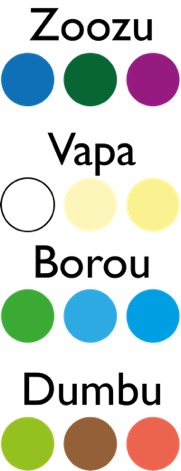
Zoozu: dark colors, typically blue, red, green, and purple.
Vapa: mainly white but also yellow shades.
Borou: green and blue colors.
Dumbu: different green colors but also red and brown.
The Himba people describe color in a very different way compared to our Western cultures, but do they still see the colors in the same way?
To find out, Sorsjegy showed them twelve green squares in a picture, one of which had a slightly different shade of green. This was easy for the Himba people to discern but very difficult for us with our eleven-color vocabulary. In the next test, Sorsjegy showed eleven green squares and one blue square. For those of us who have an eleven-color vocabulary, it is extremely easy to point out the blue. But for the Himba people who use the same word for both green and blue – “borou” – it took them much longer to distinguish the blue. Sorsjegy concluded that the Himba people, who have a very small color vocabulary, see the world somewhat differently than we do when it comes to colors.
People speak different languages, read in different directions, symbolize emotions in different ways and illustrate pictures differently. In addition, people might even have a different color vocabulary. What we can learn from these various experiments and tests is that people perceive colors in different ways – both emotionally and physiologically. We cannot influence how people see colors, but we can bear this in mind.
Color blindness
We also need to be aware that not all people CAN see colors. Approximately eight percent of men and one percent of women are color blind. The most common form of color blindness is some form of red-green blindness. This means that those affected can hardly – or not at all – see the difference between red and green. To make sure our image is perceived correctly, we need to ensure that nuances can be sufficiently distinguished. If this is not possible, we might have to consider supporting text to explain the color differences.
Conclusion: The need for a code key
We are increasingly moving towards image-based information, and even if images are a smart solution, they are not entirely straightforward. In Sweden, as in many other places around the world, “accessibility” is becoming more and more important. As technical communicators, we need to cater to people who are illiterate while making sure that the images we provide are not misinterpreted.
Ask yourself who your user is. It is important to create target group-specific information that will reach the user. Finding out as much as possible about our user will lead us to produce the information, text, and images that speak to them. Try to find the right level between text and image. Try to find the key.

To get back to our earlier examples: You could number images to avoid reading them in the wrong direction or the wrong order, as in the example of the mother with the sick child.

In the example of the icons that could be read upside down, we could add a small text such as "Fragile".

In other words, eliminating all text may not always be the best solution. By leaving a small code key of the text together with the image, we maintain a balance between our most effective language (the imagery) and each person's own language. In this way, we are on the safe side regarding our information.
As human beings, we differ a lot in the way we perceive information. There is no ultimate solution for all people around the world. But if an image is delivered with a code key, such as text, this helps people to interpret the information quickly and correctly.
"Beauty is in the eye of the beholder" is a well-known saying. But as we have seen, this perception can vary greatly depending on background, culture, and language.